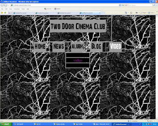
Next I added the content to the website and then asked my group what they thought. They did not like the extra column therefore I changed this.
Here is the final website I have the table central with the video on the left side and a magazine advert on the other side this makes it look more professional but not too crapped. In the middle of the table there is the text. The top row of this column says the video name which is posted above the video. On the other side there is the album name above the advert for the album.
I have also added a login feature so the user can become a member of the website.
I have also added links to the bands other websites including there Facebook and MySpace pages.

I liked the final website as it look quite professional, I like the background as it is across the three media platforms. I also like the rollover buttons as these stand out from the rest of the website


No comments:
Post a Comment