Friday 26 March 2010
Thursday 25 March 2010
Final Digipak

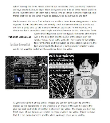
The inside of the digipak is extremely simple and is in the grey scale. The photograph on the left hand side is taken from the woods whilst we were filming the music video, in addition it is also the background of the website.
 This is the final digipak in 3D, Hennie make this digipak in 3D in Photoshop to show how it would look in real life.
Wednesday 24 March 2010
Music videos in the news
Lady Gaga - Telephone aticle
Tuesday 23 March 2010
Individual Responsabilites

Saturday 20 March 2010
Two Door Cinema Club
Evaluation question 4
Throughout our coursework we have used many media technologies right though from the construction and research to planning and evaluations. Here is a slideshow showing how I used media technologies in all the stage throughout my project.
Here are the links to the other member in my group and the technolgies they have used
Hennie
Georgina
Rakhee
Evaluation question 3
When we started making our music video we wanted it to look professional and we wanted a wide range of feedback so that we could look at their responses and how they think it is similar to a real music video. Throughout the making of our music video, we listen to our teacher opinion as her understanding and acquaintance of the music industry helped produce a successful product across three media platforms that the whole group can be proud of. Our teacher opinion has been documented though the process and has helped us changed and improve our final cut of our music video. When we deciding our storyline our teacher inform us on her opinion therefore we made changes to the first verse. Also when we made a rough cut on how our video would look she gave us some constructive criticism her is a link to her opinion on our rough cut.
Once making our second rough cut I decided to ask a few people their opinions on our rough cut. Firstly I decided to ask a few people that did not do media as then I would get feedback from people did not understand the making and editing process but that was it the age range of our target market. I got them to answer two simple questions. Here a sample of the questions and answers.
Yes as I was watching the video the storyline griped me and it was easy to follow the first it a bit slow but it seems to fit in with the song.
Yes I really liked it the scene up London looked really good and so did the woods scene
Yes it does look like a real music video; also it fits in really well with the genre of the music. I would defiantly watch this video over and over again.
In addition I received feedback from people in our class when we were editing the video telling us thing that they believe would improve our video. The main bit of feedback that kept on reoccurring was that the first verse the editing was slow compared to the music and as the instrumental before had extremely fast cuts and a quick beat the first verse seemed boring. Therefore we took this on board and speed up the editing so it fitted better with the music.
I posted our final video on a social networking site to get some feedback from people in out target audience that is people aged between 17-30. On the social networking site there was a wide range of feedback form both males and females some of the audience who media minded and some that are not.

Looking at the user feedback I have been given it was extremely positive many people liked the clown storyline and how the video was edited. Also the strobe effect seem to had to make a lot of positive feedback. Also from one person they said that the cinematography was fantastic. Many of the users said that the storyline was easy to follow but still kept you guessing throughout the video.
Evaluation question 1
ANDREW GOOWIN’S THEORY
• Visuals either illustrate, amplify or contradict the lyrics and music
• Genres often have their own music style/iconography
• Close ups should always be included
• The artist/band might want o develop their own star iconography, which become their stars image, Voyeurism is common theme within music videos
• Intertextual references are also popular
• Goodwin argues that the female performer is frequently objectified principally for display purposes, often through a combination of camera work and editing with fragmented body shots emphasizing a sexualized treatment of the star
GENERAL THEORY
LYRICS – establish a general feeling/mood/sense of subject rather than a meaning
MUSIC – tempo often drives the editing
GENRE – Might be reflected in types in types of mise-en-scene, themes, performance, camera and editing styles
CAMERAWORK- Has an impact on meaning. Movement, angle and shot distance all play a part in the representation of the band
EDITING – The most common form is fast montage, rendering many of the images to grasp on first viewing, so ensuring multiple viewing. Often enhancing the editing are digital effects, which play with the original images to offer a different kind of pleasure fir the audience
INTERTEXTUALITY - Not all audiences will spot a reference, which would not significantly detract from their pleasure in the text itself , but greater pleasure be derived by those who recognise the reference and feel flattered by this. It also increase the audience’s engagement and attentiveness to the product.


From looking at the 9 key shots above I have found that the convention we have use in our music video is the general theory.
Friday 19 March 2010
Risk Assessment
Thursday 18 March 2010
Second rough cut
Untitled from Jack Osman on Vimeo.
The second rough cut has been improved from our first rough cut, especially the introduction. The introduction now grabs the viewers attention. Although from user feedback from our teacher she did not like it all being in black and white and taking the horror of the clown. She liked the last section when it changed from black and white to colour to that it has come to life. She said that the timing was out in the first verse and the images did not hit the beat.
Wednesday 17 March 2010
Making of the website - Final Ideas

Next I added the content to the website and then asked my group what they thought. They did not like the extra column therefore I changed this.
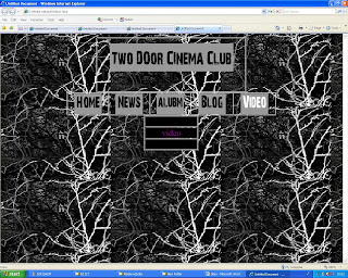
Here is the final website I have the table central with the video on the left side and a magazine advert on the other side this makes it look more professional but not too crapped. In the middle of the table there is the text. The top row of this column says the video name which is posted above the video. On the other side there is the album name above the advert for the album.
I have also added a login feature so the user can become a member of the website.
I have also added links to the bands other websites including there Facebook and MySpace pages.

I liked the final website as it look quite professional, I like the background as it is across the three media platforms. I also like the rollover buttons as these stand out from the rest of the website
Making of the website - Second Idea


Here is the a draft of the website but with further research into websites of current bands it still need more development maybe the background could be a picture of the woods and button could be more pronounced. Therefore I am going to playing around with the background and the layout.

Digi pak - Pull In Emergency, Face off

Face off
Whilst doing my research in to album cover, I found an R 'n' B album called face off. I liked this picture as it show half of two different faces. I though that this would be quite affective for the digipack front cover as one half could be the girl with normal make up on and the other side could be the girl with clown make up on. Also it could be in grey scale with the red lips in colour. The text could still be simple but may have to be quite large.

Digipak Mock ups
Georgina used the original images she had taken the create the front cover of a mock up digipak, she used simplistic text 'montepeturm' that is used also in the website. The text is discreet and sophisticated so that it will appear to the target audience which is mainly males aged between 17 and 30. By Georgina making a few different digipaks cover this gives us an insight into what would like good and what would not on our album cover.

When looking in to the back cover of digipak we did not find many as the front cover usually is the thing people are looking at. The back cover usually consists of a track list and copyright details. Georgina used two photographs one in the grey scale and the other in colour. The last back cover image is a montage of shots that links in to the video, pictures are slightly transparent so that the text can be seen.

Even more filming
Another section that we filmed in the woods was the streamers, this is used in the chorus of the video. We filmed Georgina sitting on a chair and at different stage putting more ribbon around her. we decided that the best ways of doing the was to leave the camera filming whilst putting the ribbon around her, also we filmed us taking the ribbon off. When she was sitting on the chair we got the clown to appear from behind her this looked good as you did not think that they clown would appear from behind her


The last section of filming that we did was when the girl and the clown have a face off. this is a the end of the song when Georgina turns into the clown and when she is taking the mask off. Also we showed her dropping the mask then a new hand picking it up.
Digi pack Pictures

choosing the font
From the research we did, we decided that font on album covers in the alternative/indie/rock genre are typically simplistic. I looked at a variety of fonts and found a few that I thought where particularly suitable and striking for our ancillary tasks of making a digipack and a website


Shooting schedule
- Extreme closeups of me applying makeup.
- Extreme closeups of me applying clown makeup
- A close up of my face with and without clown makeup
- A medium and a long shot of me turning to look at Hennie with clown makeup on
- A point of view shot from Hennie's position of me.
- An establishing shot of me and Hennie in the bathroom together
- A point of view shot from the bushes of me walking past
- A shot of the clown in the bushes
- A long shot of me walking through the woods and turning to see the clown (but the clown will be out of shot)
Mood Board


Monday 15 March 2010
Practice attempts of the back of the Digipak

Hennie's second attempt of the digipak had all the single on the back this is the same singles that are on their album. She decided that she would put the songs in a paragraph rather then a list as it took up less room . This is how other indie bands show there track lists.

Hennie changed the arrangement of this digipak. We are going to take some picture next week that will be the background image for back of the image.

Friday 12 March 2010
Teacher response to Rough Cut
As well as showing our teacher the rough cut we showed some classmates so they could give us some feedback. They all said that we had a good storyline that need to be changed so there are more exciting shots. A few people put across that they did not like the beginning section with the photos of the clown faces they believed it was a bit boring and did not seem to fit in with the video. Also many people said the bathroom scene did not fit in but a few establishing shots would help it fit in.
Looking at this feedback whilst watching the rough cut I could see where everybody was coming from therefore as a group we will take the constructive criticism to help us develop our music video.
More Filming
We decided that we wanted to have a scene when the girl is standing still but everything else is moving around here quickly. As a group we thought that it would be best at night as then there will be lights around the location. The best location was the millennium bridge which is just before Charing Cross station in London. We found a spot were there was a light above Georgina so she would stand out. We did a wide shot where we had the whole of Georgina body in and part of the bridge so there was people walking passed. In addition we did close up shots of Georgina both with normal make up and smudged make up but we kept here in the same place so the sequence would look more effective. Whilst we were in London we were going to try and do the bathroom scene but we did not find any one that we wanted to use. So we decided that the right location for the bathroom scene would be the toilets in our school.
The next day we filmed the Bathroom scene this consisted of Georgina putting on make with her friend which was Hennie and as she is putting on normal make up it changes to clown make up. We started by with closes up of Georgina putting on lipstick and mascara then putting on clown make. In addition there are medium shots of her with both normal make up.

Rough Cut
Here our rough cut of our music video. we did not fill in a section in the introduction with shots yet so we decided to cut out this section that is why there is a jump in the music
Rough Cut from georgina campbell on Vimeo.
Sunday 7 March 2010
Making of the website - First Idea

Wednesday 3 March 2010
Editing

We decided that we wanted our shots to be in black and white as this would give it a weird look that would go with the storyline. Also it would make it look like a horror genre of a music video.
 We used the colour corrector tool to adjust the 'white', 'mids' and 'black' to create high contrast shots, which gives a greater appeal to the video
Animatic
inspiration
In lesson we watched many videos from the previous years and we liked many of ideas one we really liked was the the flower blossoming and wanted to use this idea but it would take a long time to do so we have adapted it. So the new idea is that we will film the rose petal falling of rather the blooming and dying
One of the video that we found on YouTube that was about clowns, one of the videos we found was Pennywise the scary clown from the film IT. The clip that we liked from the movie was was when the men was in the back of a taxi and he see Pennywise at the side of the road with balloon, when he turn forward he has a balloon next to him in the taxi. When Hennie found this clip and shared it with us we all watch it and wanted to include and adaption of this in our video. so the idea we had would be the girl walks past the clown in the woods and he would have balloon in his hand then when she turns around she will have a balloon is her hand.
Georgina found a music video called The Way I Am by Ingrid Michaelson. In this video the girl is the only perosn that is not dressed up as a clown and she is the outcast, people think that she is wired and laugh at her but there is one man who is in love with her. From this video we liked the clown make up any the way the girl reacts around the clown.


